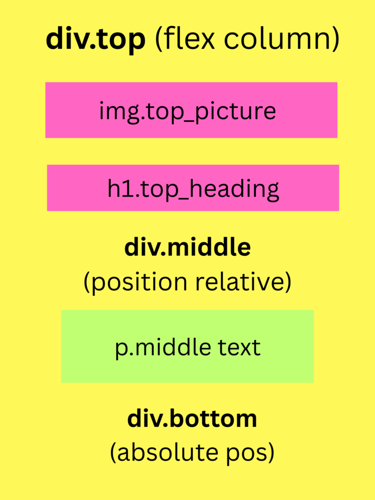
The Value of Using Flexbox for Web Layouts
Flexbox is a CSS layout model that simplifies aligning, distributing, and spacing elements within a container and it ensures that elements are properly positioned regardless of screen size.
How can Flexbox be Helpful?
Automatic Space Distribution – No need to manually calculate margins or padding.
Alignment Control – Easily center, justify, or align items.
Flexbox navigation code-block:
.navbar {
display: flex;
justify-content: space-around;
align-items: center;
background-color: #333;
padding: 15px
}