Topics
- CSS Reset
- Responsive cards, using flexbox and media queries
Tutorials
Problem Set
Find a card model or a piece of 2D design (it must include, image, and typography) from designspiration, then draw over the design a ‘box model’ for the main layout of the design. Take a screenshot/photo of the drawing. From there, come up with a HTML skeleton strategy.
Below is a sample:
- Pick your design from designspiration;

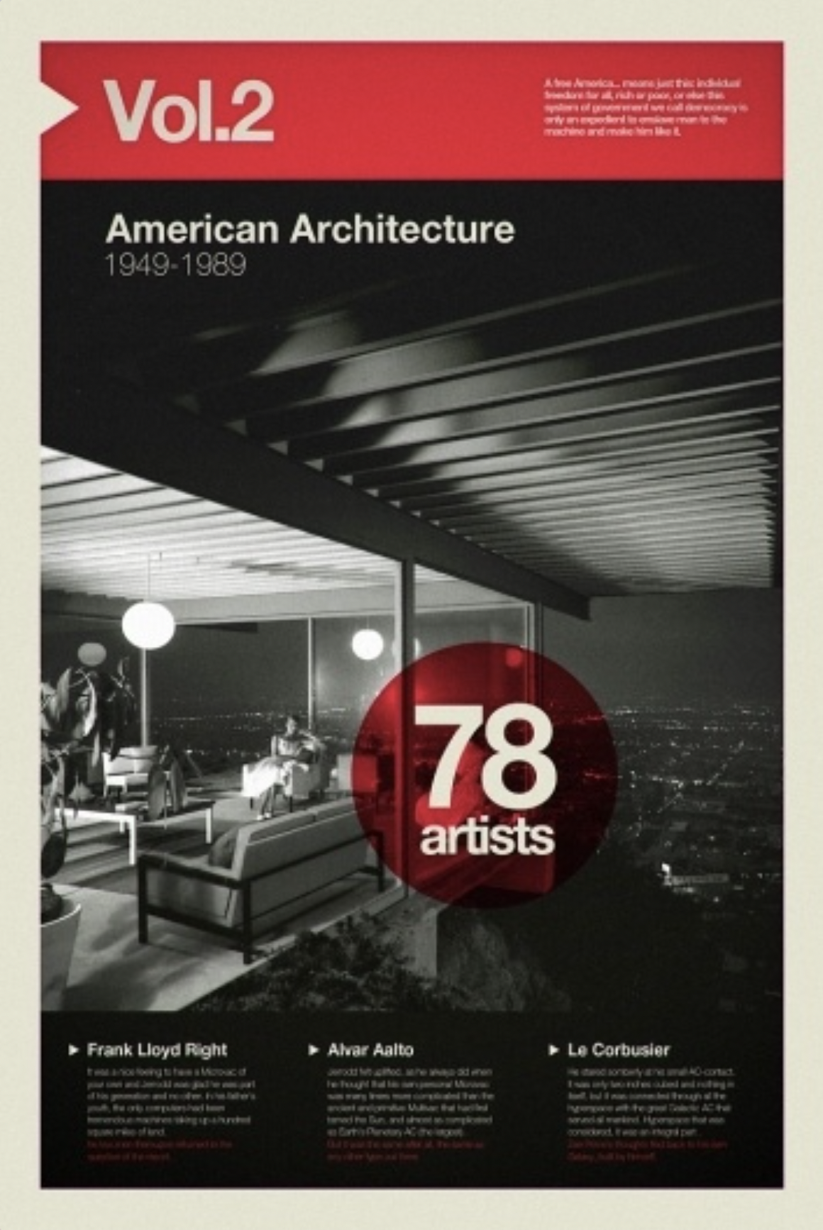
- Draw boxes on your design;

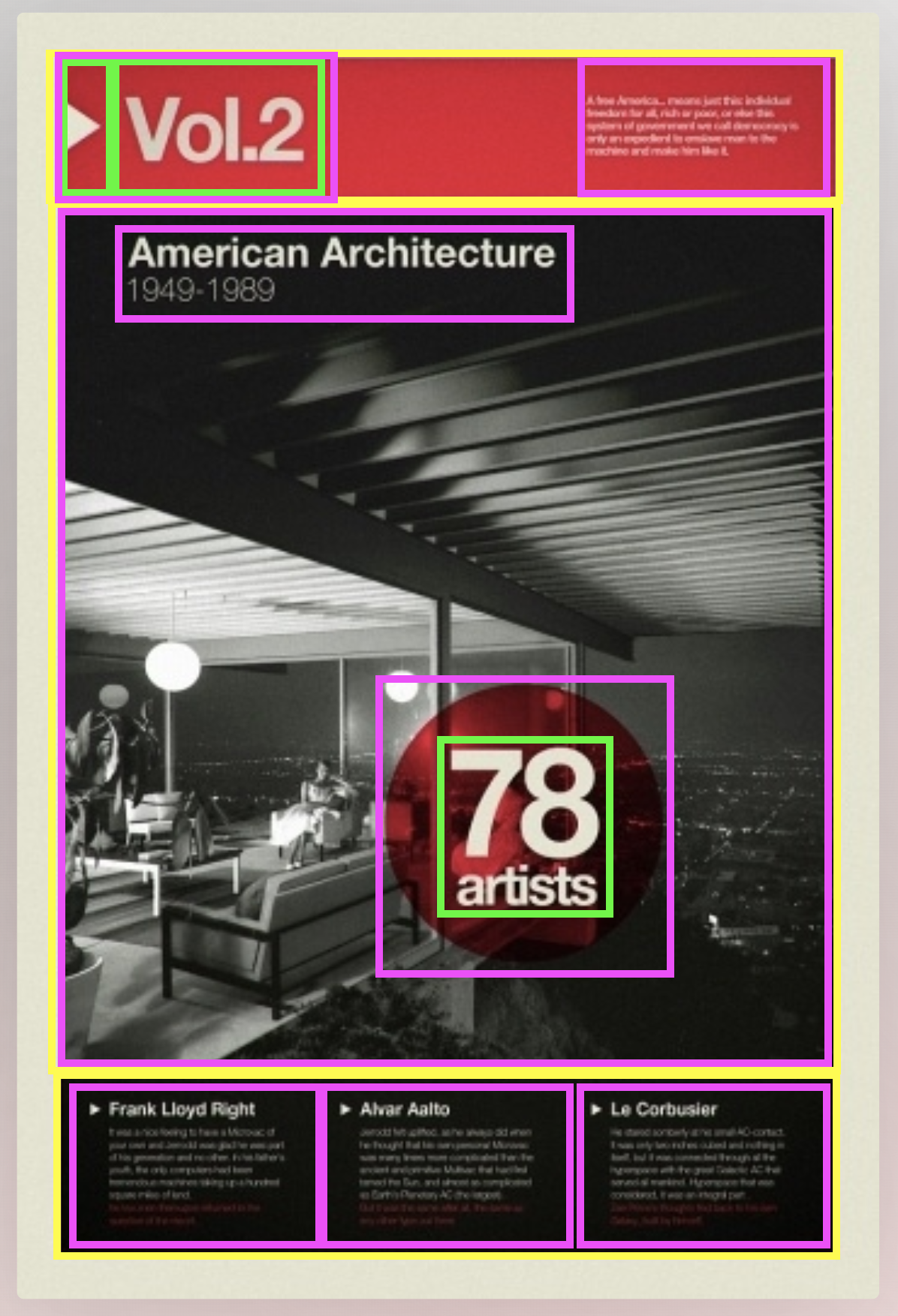
- Draft an HTML skeleton with CSS notes of flexbox and absolute positioning;

**** Optional build *****
- Gather your assets: fonts, images, colors;
- Create your HTML, consider including an image of the card to design against;
- Set your CSS resets, set the default font, and set the container width;
- Write your flexbox layout working outside to inside;
- Move to paddings, margins, and borders;
- Move to typography;
- Juggle changes use the inspector to help with adjustments.
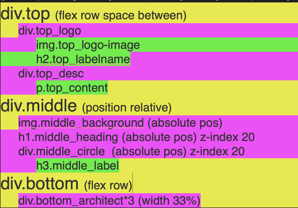
<div class="top">
        <div class="top_logo">
            <img src="" alt="" class="top_logo-image">
            <h2 class="top_label-name"></h2>
        </div>
        <div class="top_description">
            <p class="top_content"></p>
        </div>
    </div>
    <div class="middle">
        <img src="" alt="" class="middle_background">
        <h1 class="middle_heading"></h1>
        <div class="middle_circle">
            <h3 class="middle_label"></h3>
        </div>
    </div>
    <div class="bottom">
        <div class="bottom_architect"></div>
        <div class="bottom_architect"></div>
        <div class="bottom_architect"></div>
    </div>
.top {
display: flex;
justify-content: space-between;
}
.middle {
position: relative;
}
.middle_background,
.middle_heading,
.middle_circle {
position: absolute;
}
.middle_heading,
.middle_circle {
z-index: 20;
}
.bottom {
display: flex;
}
.bottom_architect {
width: 33%;
}
Final rebuild for fun (definitely not required).
For the blog
Describe your understanding of the value of using flexbox to layout elements on a webpage. Give a particular example of how it is help and use a code-block with HTML to support your description.