Topics
- focus on concepts, not memorizing the properties;
- flex shorthand
- flex-direction
- flex-wrap
- justify-content
- align-items
- flex-basis, grow, and shrink
Tutorials
- Responsive CSS & Flexbox, videos 102 – 113, Responsive/Flexbox CODE
flexbox_starter / index.html & app.cssflexbox/ index.html & app.cssmedia_queries_starter/ index.html & app.cssmedia_queries/ index.html & app.css
Problem Set
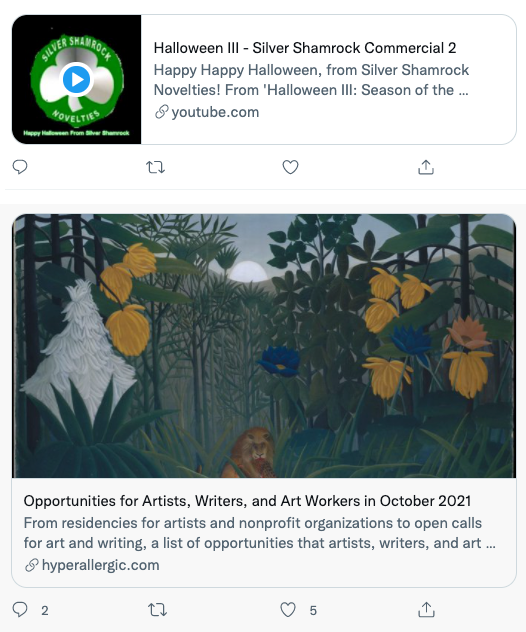
SIMPLE RETWEET CARDS WITH TWO MODES: HORIZONTAL AND VERTICAL.
Using flexbox create two cards modeled after the images above. Using the same HTML, create classes that allow you to switch between horizontal and vertical just by adding or removing a class.
Your HTML boilerplate should look something like this:
div.carddiv.card_mediaimg.card_image
div.card_contenth2.card_titlep.card_slug
You should put your cards in a div.container which you set to a max-width: 500px and set a margin: 0 auto to center the container.
Try to incorporate the following pieces of design:
- attach and use a Google font which has enough typefaces to model the bold, medium, normal font weights;
- color your text to match the design;
- Create the borders in your design including the rounded corners.
tweet card solution with fixed aspect ration media boxes
For the blog
Describe the two flex container properties for affecting the position of flex items along the main axis and the cross axis. What are these two properties and what are some of the values that can be used?